Splyt
Making Group Payments Simple, Transparent, and Fair.
Overview
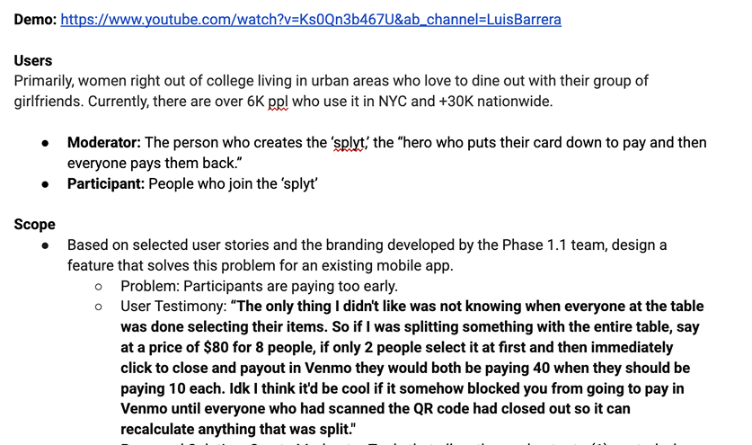
Splyt Pay is a mobile application designed to solve one of the most awkward pain points in group dining: splitting the bill. With a single photo of a receipt, users can convert it into a digital itemized list and assign costs based on what each person ordered, ensuring everyone pays their fair share.
The challenge
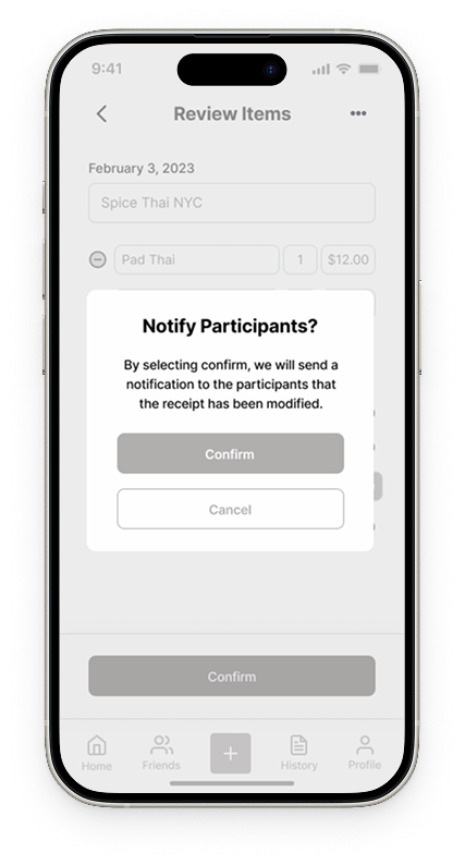
While Splyt Pay’s initial design allowed users to scan and split receipts, the experience often broke down at the final step of payment. Participants were paying too early, leading to miscalculations and frustration.
The Opprotunity
To restore trust and fairness in group bill splitting, our team focused on making the process visible, editable, and accurate from start to finish. Our key goals were to:
Eliminate Premature Payments
Improve Transparency and Control
Enhance Collaboration and Feedback
Roles and timeline
My Role: User Experience Designer
Team: User Experience Design Team, Project Management
Timeline: November 2022-April 2023
Discovery
Project Kickoff
Project Scope
During the client kickoff, I led the discussion and asked targeted questions to clarify priorities and expectations, ensuring that every design decision was grounded in solving user pain points while supporting business goals.
Ideation
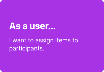
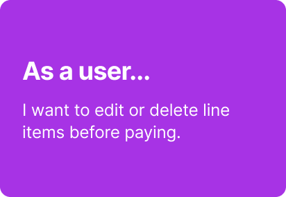
User stories
To focus our design scope, I lead the development of 2 key user stories:
User Flows
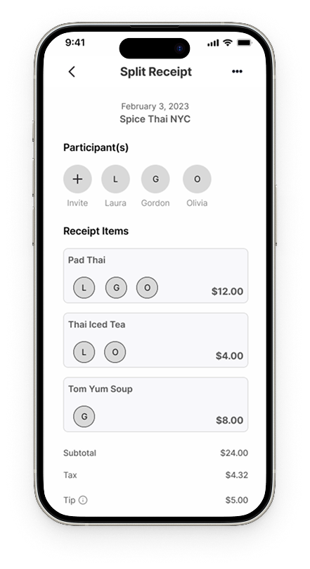
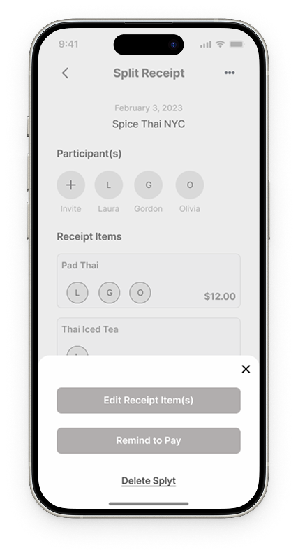
Our primary goal was to create a clear, straightforward flow that allows moderators to customize receipts with greater flexibility. We mapped the end-to-end user journey based on client-identified pain points, uncovered additional areas of friction, and divided the resulting user flows across the design team for execution.

One of the two wireframes created
Early Design Exploration
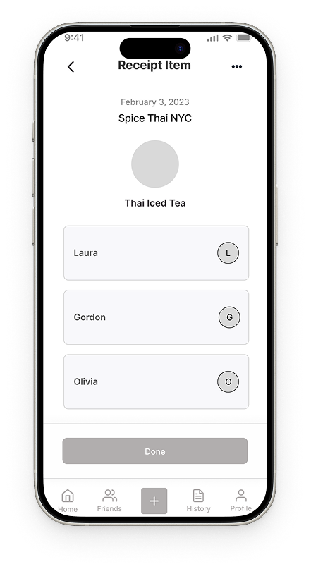
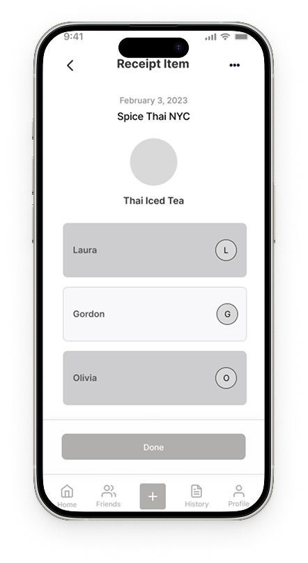
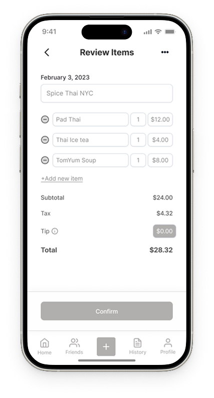
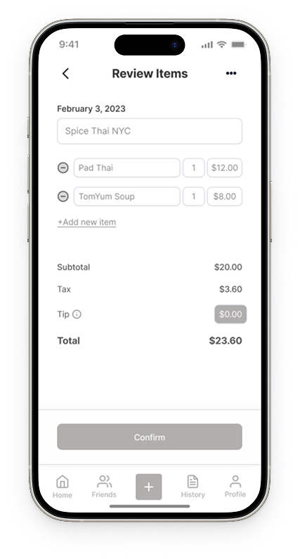
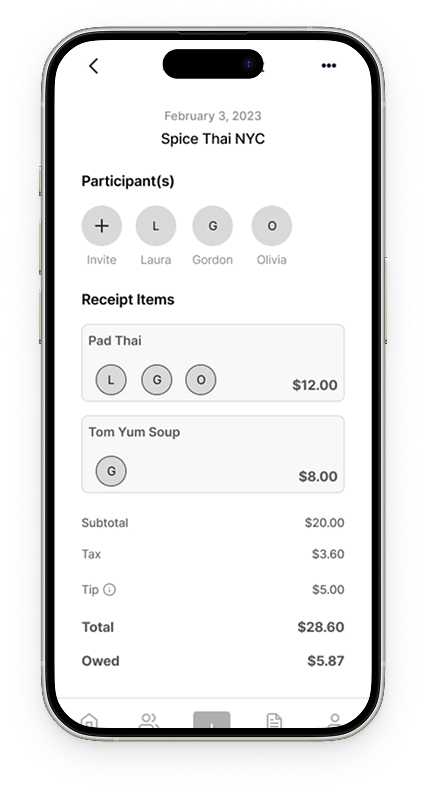
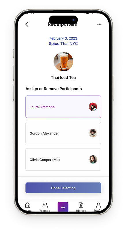
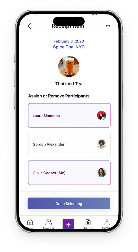
With the goal of providing transparency when splitting the bill, we prioritized reflecting this clearly in early wireframes. I led the design of the item-assignment screens, enabling moderators to easily manage and allocate items across the group.
Design
Need for Inspiration
We created a mood board to define the brand’s visual direction, curating imagery, colors, and UI inspiration aligned with its values. Through collaboration and refinement, it guided consistent design choices across typography, color, iconography, and imagery.

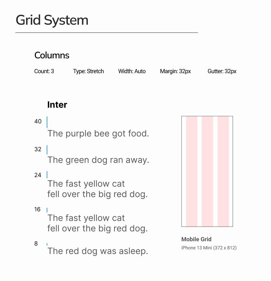
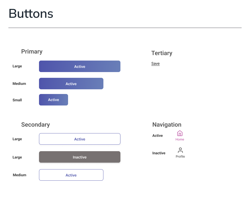
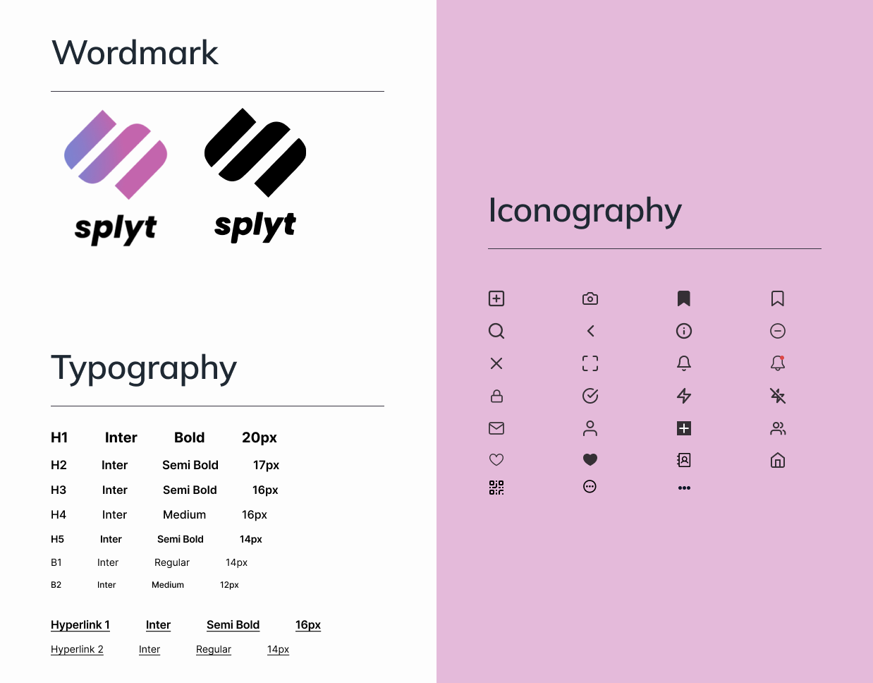
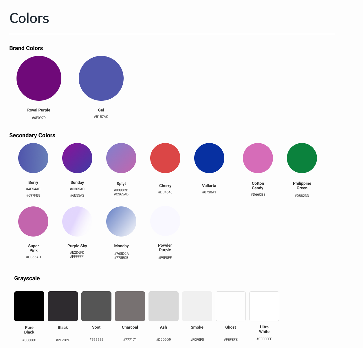
Style Guide
We developed a comprehensive style guide that reinforced Splyt Pay’s brand through vibrant colors, rounded typography, and consistent layout grids and spacing.
The Result: a cohesive visual language that strengthened brand trust and recognition.
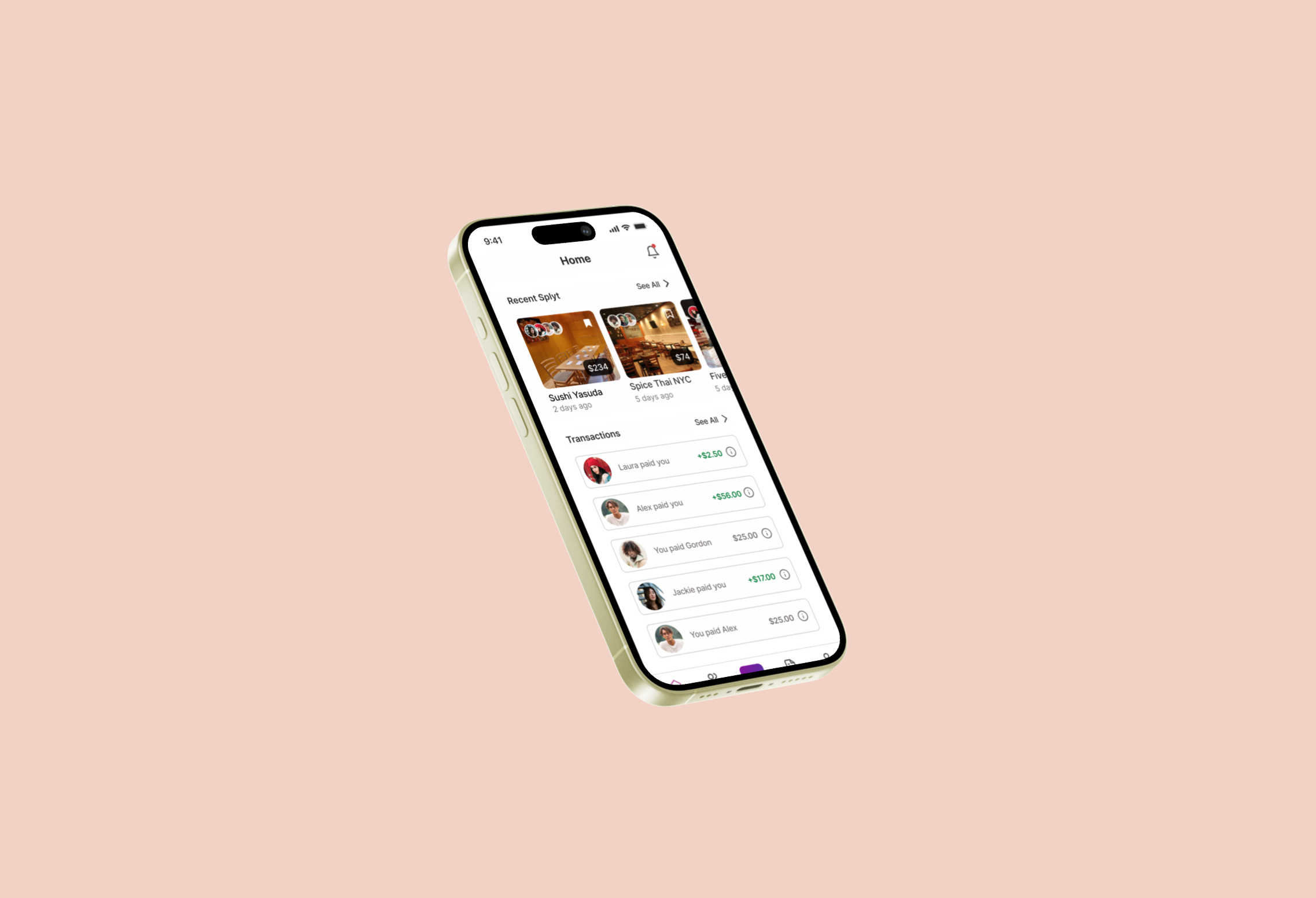
Final Designs
Once the style guide was finalized, we moved into high-fidelity designs focused on solving the client’s core problem while bringing the brand and user experience to life. I prioritized the item assignment feature, ensuring every user action felt intuitive. Through close collaboration, we delivered cohesive, visually polished screens that aligned with the design system and addressed key user pain points.
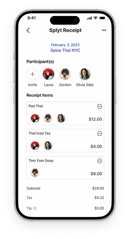
Prototype
After positive client reviews, I built a high-fidelity interactive prototype in Figma to simulate the full user journey. The prototype focused on validating two outcomes:
Users can accurately and transparently assign items
Payments are completed only after all assignments are verified.
Reflection
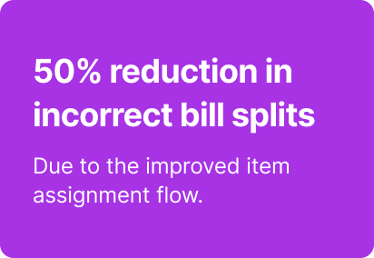
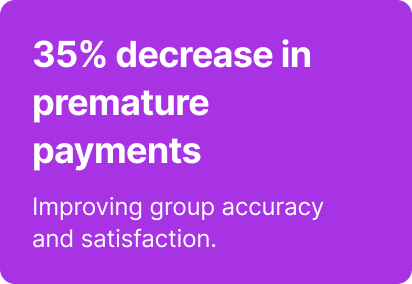
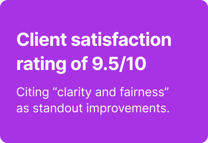
The Results
The redesigned Splyt Pay experience led to strong user validation and client satisfaction during testing and review cycles. Early feedback and performance metrics showed clear improvements:
Turning Complexity into Clarity
This project reinforced the value of designing for clarity and control in collaborative financial experiences. Key takeaways included the importance of cross-functional collaboration and rapid iteration, where frequent testing refined small details that drove meaningful impact. The Splyt Pay redesign showed how thoughtful interface decisions can significantly improve both emotional and functional outcomes in shared expense management.