Chiproof
Making Quality Housing Accessible to Every Nigerian
Role
User Experience Designer
Timeline
January 2023-March 2023
Team
Moment Studio Design Team
Platform
Desktop
Chiproof is an emerging B2C property-renting platform in Nigeria, created to simplify the process of finding affordable homes that align with users’ income. As the company prepared to launch its online application, it aimed to empower users through rent financing options, easing the burden of upfront rental costs for students, professionals, and families alike.

The Challenge
Finding suitable housing in Nigeria is often time-consuming, opaque, and financially draining. Many renters struggle to secure properties within their income range, while existing rental platforms lack transparency or financial flexibility.
The client asked for a user-friendly web application that:
Clearly showcases Chiproof’s mission and services.
Enables users to search for properties by income or salary range.
Offers a rent financing application process that feels seamless and trustworthy.
The goal was to build trust, accessibility, and inclusivity into every part of the experience.
The Solution
We designed a web platform that humanized property search and made financial accessibility the centerpiece of the user journey.
Empower Users Through Simplicity
Built an intuitive, responsive interface that supports renters from all backgrounds.
Simplify Exploration and Navigation
Introduced an Affordability Calculator that lets users input their income and instantly see homes within their budget range.
Drive Engagement and Conversion
Designed a streamlined rent financing application flow, minimizing form fatigue through progressive disclosure.
The result was an inclusive and empowering experience that made housing search feel achievable, not intimidating.
Design Process

Discovery
Understanding the Client
The client emphasized the need to design for varied personas — students, professionals, families, and retirees. They also wanted the website to serve as both an informational and transactional platform.
During our kickoff, we refined the scope to focus on:
A property listings page with search by income range
A rent financing application flow.
Supporting pages such as About and Contact.
Ideation
User Stories
Based on client input, we developed and refined five key user stories, eventually focusing on rent financing
As a user, I want to view property listings within my budget.
As a user, I want to fill out a rent financing application easily.
As a user, I want to learn about the company before applying.
User Flows
We mapped seven critical user journeys, from browsing properties to submitting a financing request. This helped visualize information hierarchy and interaction pathways for different user goals.

One of the many wireframes created

Mid-Fi Wireframes
I led the design of the rent pre-qualification screen, prioritizing ease of use and clarity. Using Figma, our team created consistent mid-fi layouts.
My Focus: a clean layout that that allowed users to navigate intuitively, reducing form abandonment.
Design

Design Inspiration
For the rent financing experience, I focused on simplicity, clarity, and accessibility. Inspiration came from fintech and property platforms like PiggyVest, Zillow, and CredPal, ensuring users could trust and understand the process instantly.
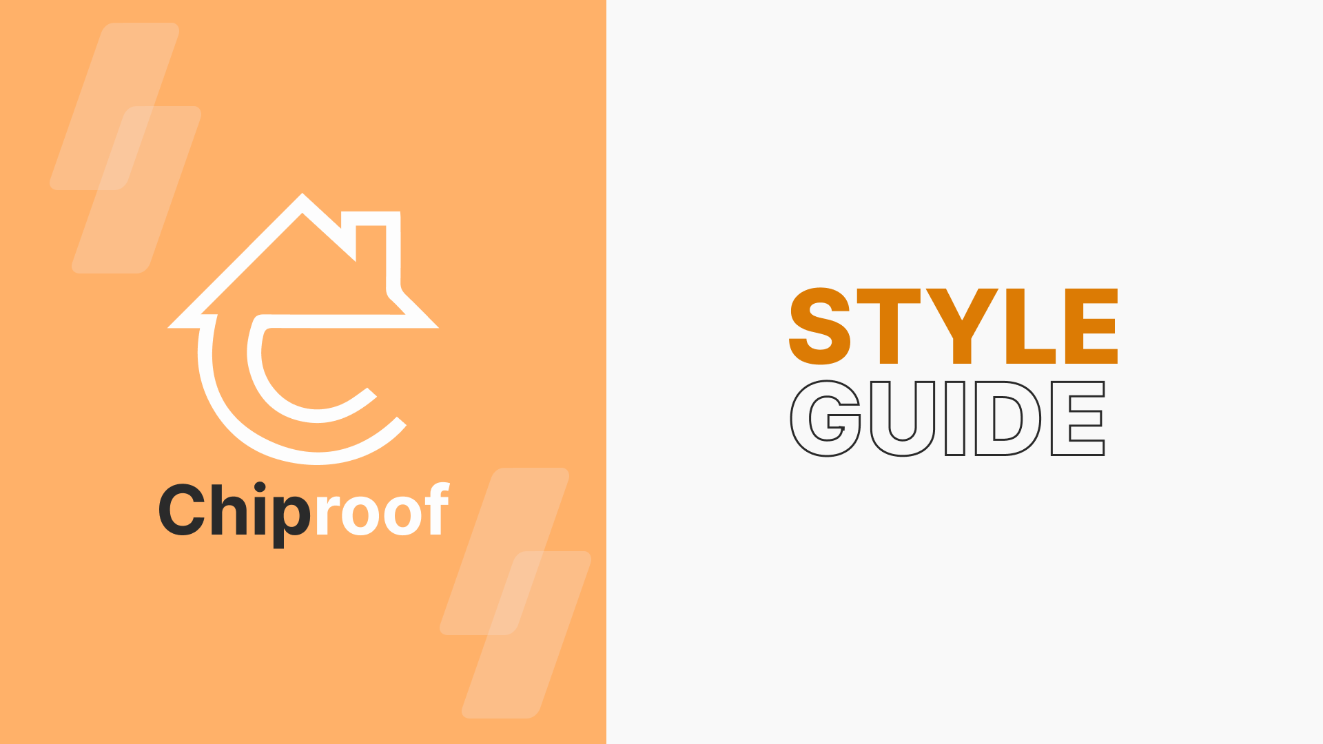
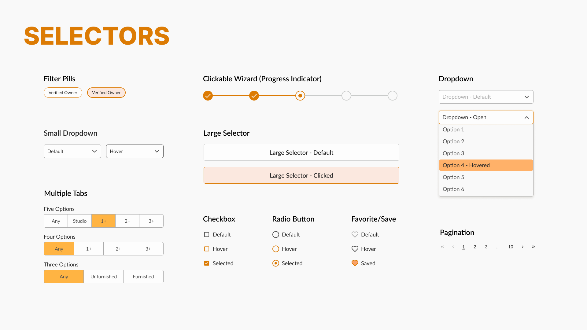
Style Guide
To maintain a cohesive look and feel, we developed a comprehensive style guide that included:
The Result: a cohesive visual language that strengthened brand trust and recognition.


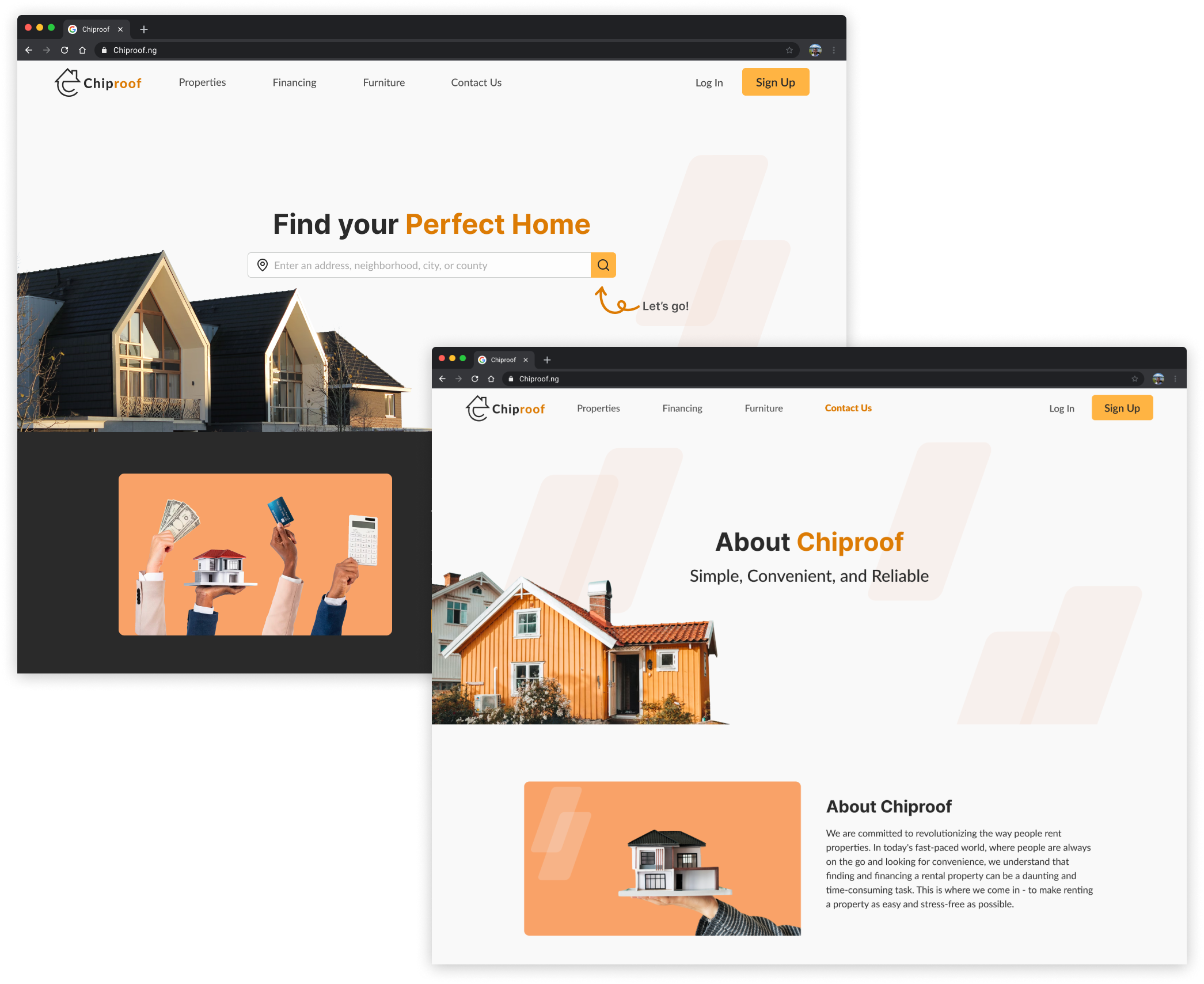


High-Fidelity Screens
We transformed our wireframes into high-fidelity mockups that captured both aesthetic appeal and usability. During reviews, the client appreciated the modern look but requested a more minimal landing page, which I refined to balance simplicity with brand storytelling.
Results and Reflection
The Results
The redesigned experience resonated strongly with both the client. After the final handoff, we received the following:
Client satisfaction score of 9/10
Citing “clarity, usability, and strong visual communication.”
The Reflection
This project taught me valuable lessons about designing for social impact and how thoughtful UX can bridge accessibility gaps and make essential services feel achievable. Some key takeaways include:
Designing with empathy is powerful: Understanding real housing struggles helped us prioritize features that matter.
Structure and consistency create trust: A strong visual system fosters credibility in financial and housing platforms.
Iteration fuels clarity: Every design critique brought us closer to a solution that felt natural for real users.
Working on Chiproof deepened my appreciation for design that serves communities, not just users. Being able to blend empathy, structure, and creativity allowed my team and I to create an experience that helps Nigerians find homes with dignity and confidence.