Admybrand
Redefining B2B Ad Buying Through Simplicity and Trust
Overview
AdmyBrand is an emerging B2B SaaS platform in the Indian advertising market, designed to connect ad buyers with diverse ad spaces.
The challenge
Client insights indicate that users experience difficulty navigating AdmyBrand’s website and identifying a clear starting point. Additionally, a lack of brand awareness leaves users uncertain about AdmyBrand’s credibility, resulting in low trust, poor user experience, negative feedback, and loss of users to competing platforms.
The Opprotunity
Create a more engaging and simplified experience with the goal of:
Building trust and credibility
Simplifying Exploration and Navigation
Driving Engagement and Conversion
Roles and timeline
My Role: User Experience Design Lead
Team: Moment Studio User Experience Design Team, Project Management
Timeline: September 2023-February 2024
Discovery
Project Kickoff
I kicked off the project by aligning the team with client goals, communication, and collaboration. We gathered insights from the client through a questionnaire and performed a walkthrough of the existing site, clarifying key user pain points and redesign goals.
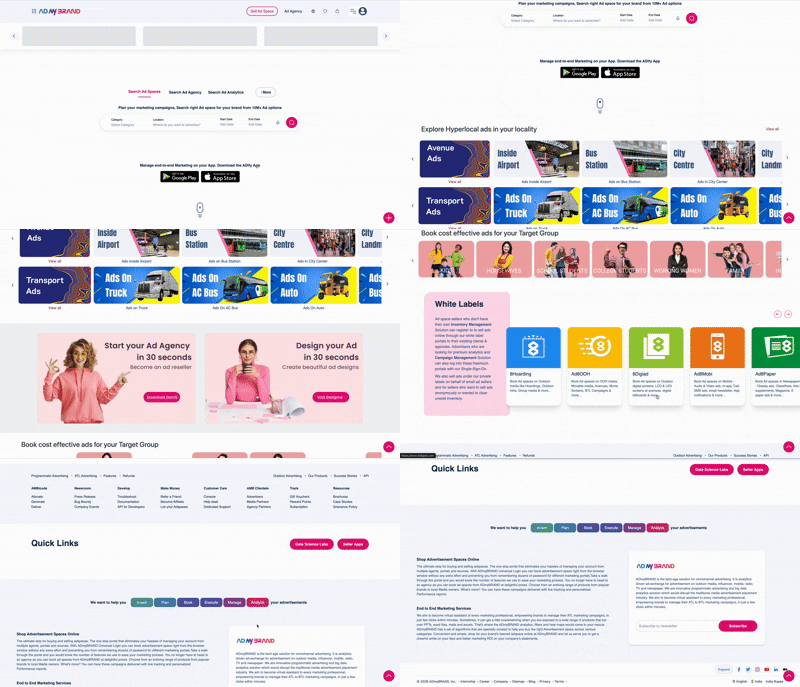
AdmyBrand’s Original Site Design
Hearing from our users
To validate these insights, I led usability testing and analyzed direct user feedback. Recurring usability issues resulted in decreased task completion for 16 out of 20 users due to lack of visual hierarchy, information overload, and the overall site not being informative. After identifying key challenges, the team prioritized high-impact improvements, with me leading the redesign of the landing page’s navigation.
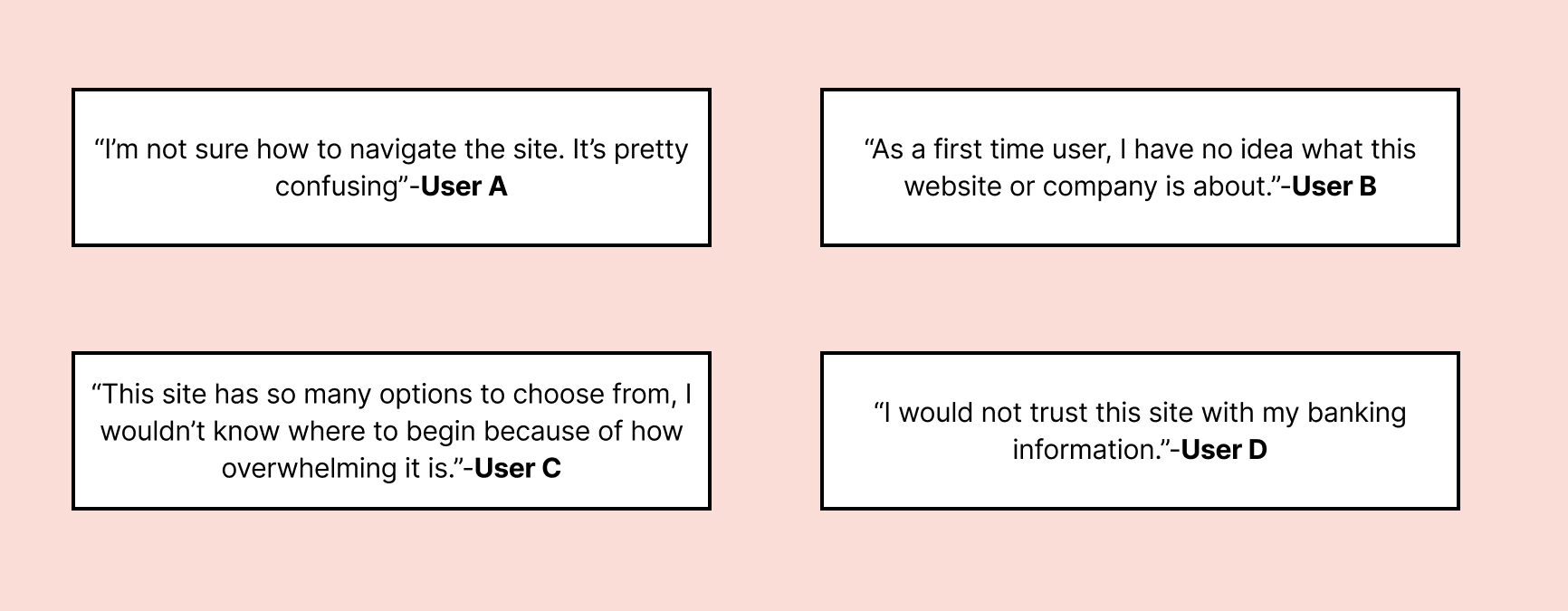
Qualitative User Feedback
Learning from Competition
I conducted a competitive analysis of GroundTruth, Adriel, and The Trade Desk to understand how landing pages communicate transparency and guide users through ad purchasing. Key patterns around navigation, content hierarchy, and the use of visuals and education informed my approach to creating a clearer structure, stronger visual hierarchy, and a more approachable entry point for new users.

Ideation
Translating Insights into User Stories
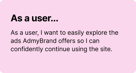
Before I could start designing, I had to identify the most important functions the client needed me to develop. Using both qualitative and quantitative insights from both users and client, I developed 2 user stories as a base for the design:
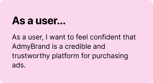
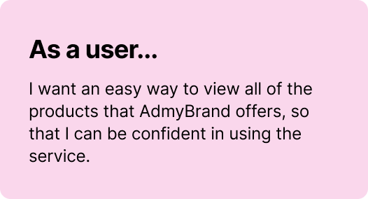
Mapping out the structure
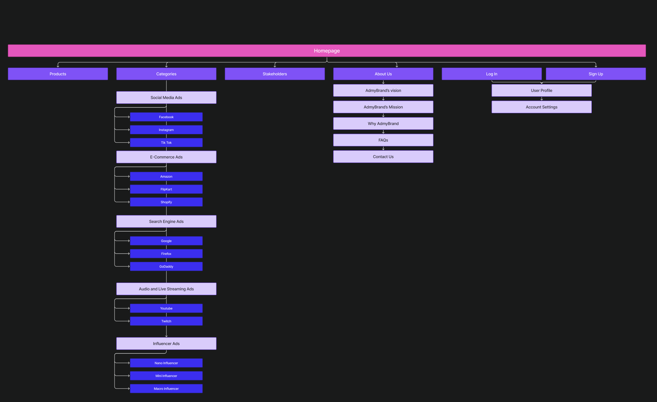
I led the information architecture for the landing page, ensuring the structure was intuitive and easy to navigate. The goal was to present information in a clear and logical flow that reinforces credibility, builds trust, and supports user confidence throughout the experience.
Early Design Exploration
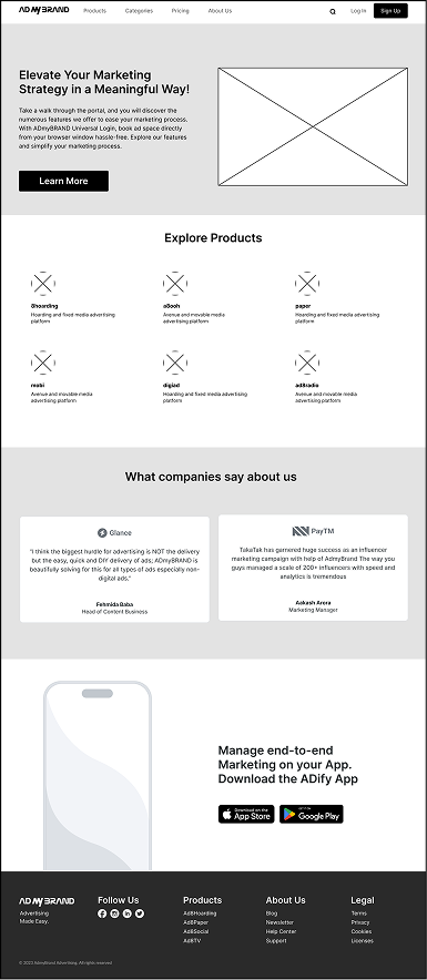
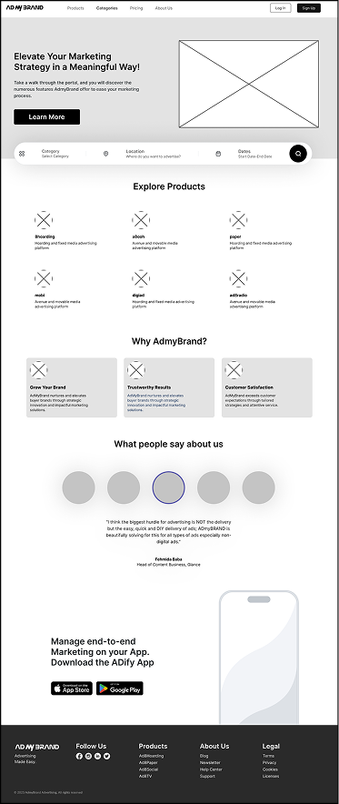
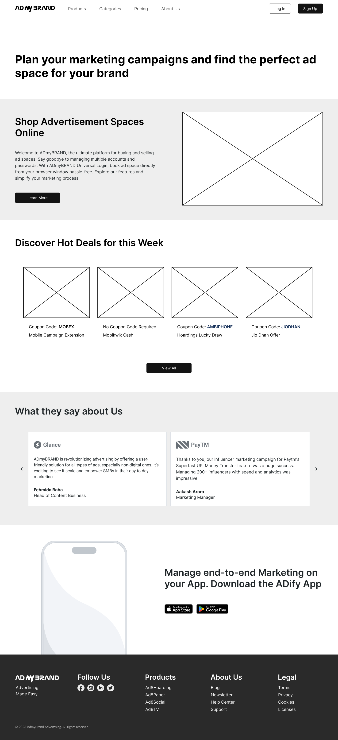
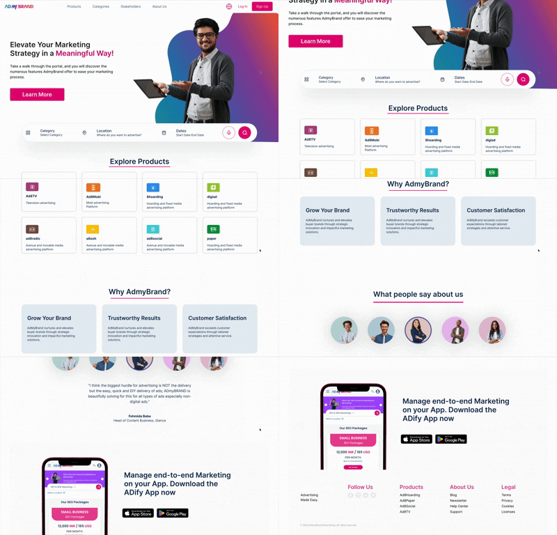
When exploring early design iterations of the landing page, I set out to create a clean, intuitive experience that made users feel informed and excited about purchasing ads through AdMyBrand. I developed three initial concepts to explore this direction, but client feedback surfaced a critical gap: users needed a faster way to discover ads tailored to their specific needs right from the landing page. Taking this insight back to the drawing board, I evolved the design by introducing a landing page search feature, transforming the landing page into a more dynamic and goal-driven entry point.
Design
Establishing Visual Consistency
To ensure consistency, we created a comprehensive style guide covering color, typography, iconography, and imagery. Because AdMyBrand is a bold and striking brand, the guide was designed to reflect and reinforce that visual identity.
The Result: a cohesive visual language that strengthened brand trust and recognition.


Bringing the Experience to Life
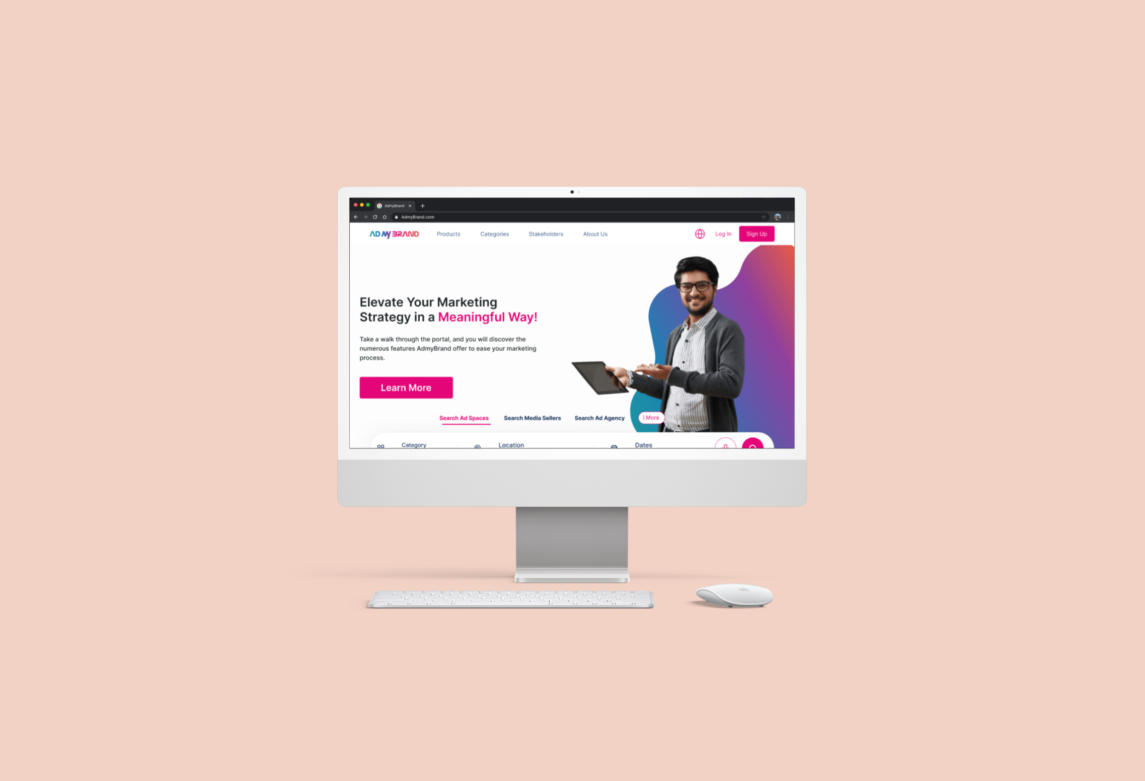
Our polished designs balanced elegance and usability. I incorporated these refinements to deliver a professional, modern, and inviting experience that helps users feel confident purchasing ads with AdMyBrand.
Reflection
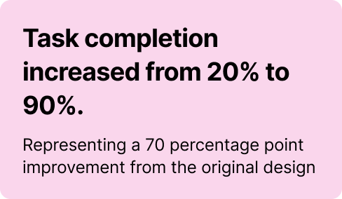
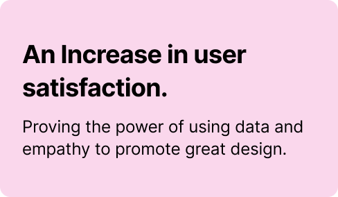
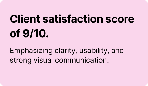
Measuring Outcomes
Designing for Accessibility and Clarity
This project reinforced the importance of designing with empathy for users in complex digital spaces. By deeply understanding how new users evaluate credibility and navigate uncertainty, we were able to prioritize clarity over feature density, use structure and visual hierarchy to build trust, and design an experience that clearly communicated AdmyBrand’s value. Through iterative exploration and feedback, the final solution felt more approachable, intuitive, and confident, helping users understand what the platform offers and what to do next.
